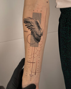
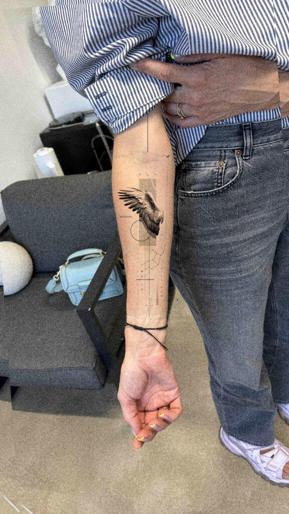
Healed inner forearm tattoo — 1 year 10 months healed


Case notes
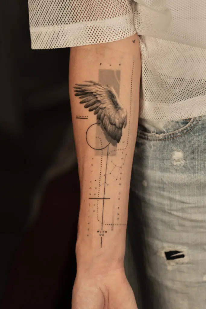
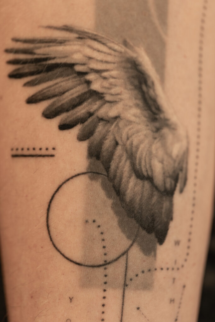
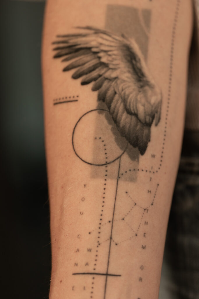
What makes this case special is the contrast between a soft organic wing and a very precise graphic system around it. The wing carries the emotional weight of the piece, while the lines, text, and spacing keep the composition structured and readable over time.
Documentation gallery
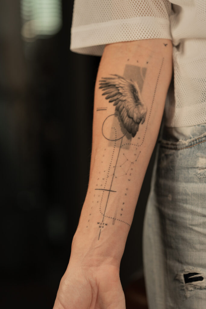
After healing, the wing remained the main focal point, while the softer feather transitions settled naturally into the skin. The typography and graphic elements continued to read clearly, helping the composition stay light, balanced, and structured over time.
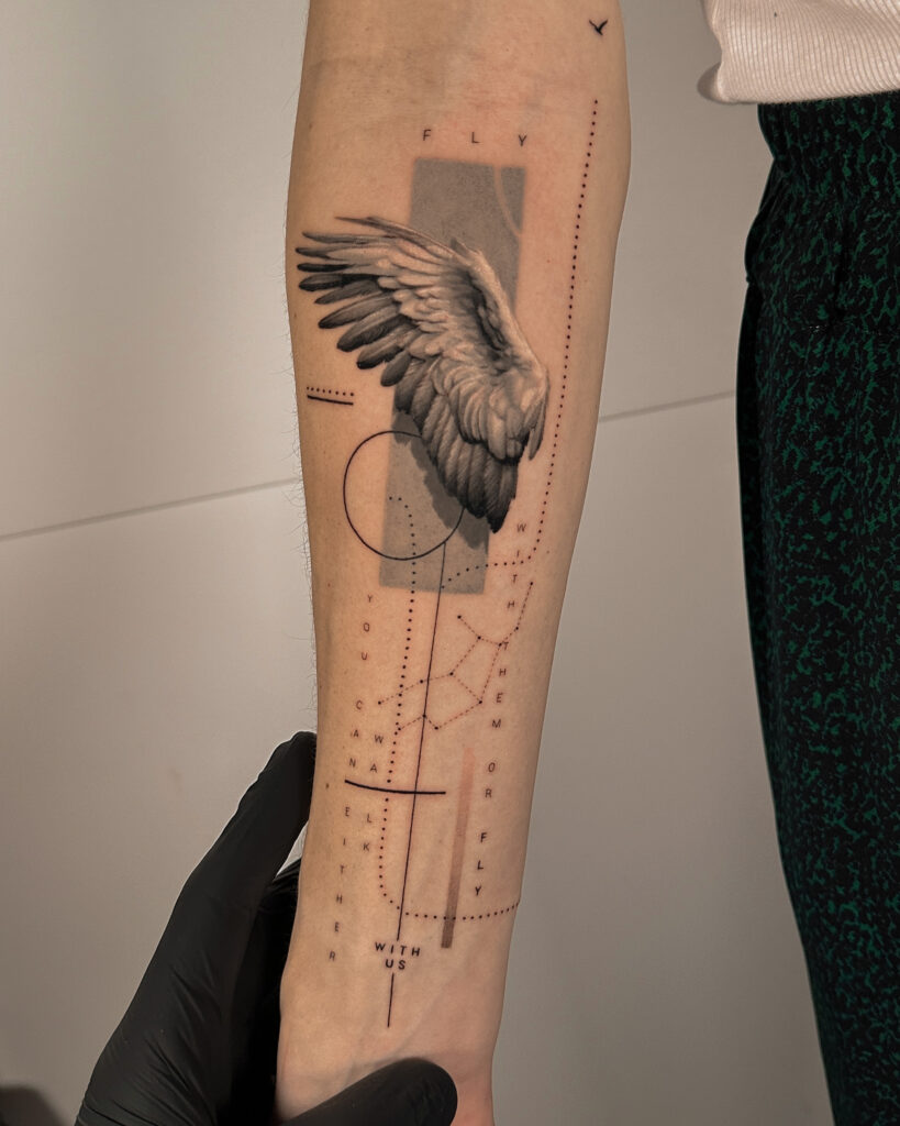
Fresh, the contrast between the soft wing and the precise graphic structure was at its strongest. The piece already felt light and controlled, with the typography, dotted paths, and linework supporting the wing without competing with it.
Case details
What this case shows
Readability
The wing remains the main focal point because the composition is built around one soft but clearly defined central form.
Contrast
The organic feather structure stands out more strongly because it is framed by minimal graphic elements rather than competing detail.
Structure
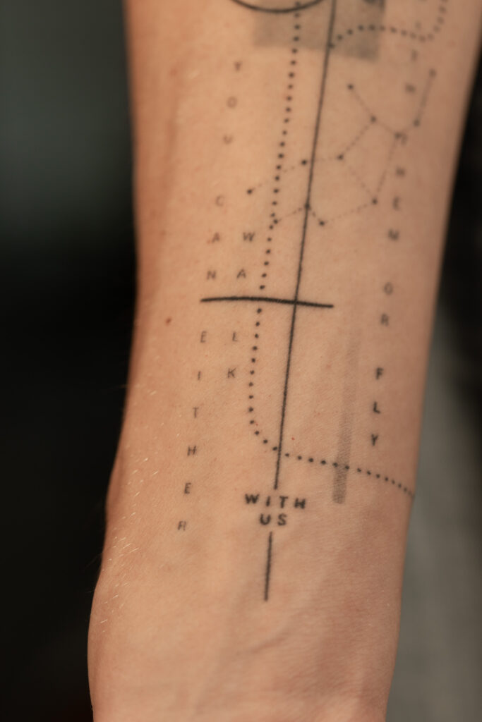
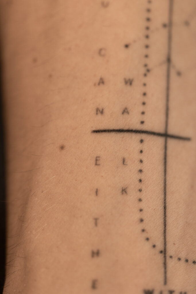
Typography, dotted paths, and geometric lines create order without overwhelming the main image.
Spacing
Open skin and measured distance between elements help the piece remain calm and legible over time.
Balance
The composition works through the tension between softness and precision, giving the piece both atmosphere and control.
About this project
This piece was built around a soft wing form placed within a controlled graphic structure. Typography, dotted paths, geometric framing, and open spacing were used to keep the composition light, directional, and calm rather than visually heavy.
Healed observations
A few things this healed case makes visible:
- The wing remained the strongest visual anchor after healing.
- Softer feather transitions settled naturally into the skin over time.
- Typography and graphic lines stayed clean and supportive.
- The overall composition remained light, balanced, and easy to read.
- Open spacing continued to help the piece feel calm rather than crowded.
Why it matters
What matters is not the day-one impression, but what remained over time.
If this is the kind of result you care about
Start with a consultation. The process begins before ink — with planning, placement, and decisions made for time.